
![]()
The key reasoning behind the change is because of the history that comes with our logo. During the early periods of the 2000’s the logo that the WACUA use today was adopted. From evidence in committee meeting notes during that period and historical investigation we, the committee, found that this logo was never approved, even by the members themselves. It was simple redesign that everyone just accepted…
The WACUA committee are striving to promote the umpiring body in Western Australia to all of cricket, either local, national or international. We feel that time is right to market and advertise ourselves as the leading umpiring association within Australia and one of the leaders throughout the world. To do this, we need a clear distinctive badge to show with pride.
The history of our logo is actually quite simplistic. Every logo since the birth of our first logo has been with the ‘Owl of wisdom’ and ‘Scales of justice’. Variants of colour have come and gone where it was once black and gold and changed to blue and gold, but the traditional fundamentals have never been changed.
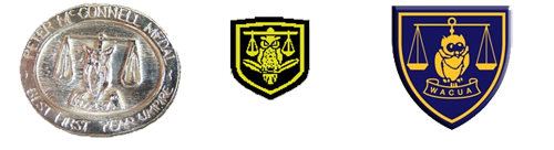
Some key features of the new logo.
- The text WACUA aligns ourselves with the similar font that the WACA have used in their logo redesign. This allows the WACUA to visually create a relationship with the WACA.
- 1908, our founding year is instantly seen on the logo. Showing our proud history and denoting that we are one of the oldest umpiring representative bodies in Australia.
- The black and gold returns in the sense of the cricket ball at the front of the background blue. Giving us a sense of history and representative status of our great state.
- The ‘Owl of wisdom’ is aligned closer to our earliest version of the logo with the high feathered eyes and symmetrical stature.
- The ‘Scales of justice’ also feature in the logo bringing the sense of new tradition and pride with the blending with the richer and more unique blue.